Beyond Polymarket and Kalshi: The UX Problems the Next Platform Must Fix
Last updated: July 2026 · 7 min read
Polymarket and Kalshi proved that prediction markets can reach a large audience. What they have not yet done is make the experience feel effortless. Their products were shaped by and for early adopters — people comfortable with wallets, order books, and probability math. The next wave of users will not be, and that gap is exactly where a better-designed platform can win.
As one industry expert put it, it takes “just one company to come and completely change the concept, and then everyone else follows.” In consumer technology, that company is usually the one that makes a complicated activity feel simple. Here are the user-experience problems that still hold prediction markets back — and what fixing them would look like.
Quick Answer
The biggest opening in prediction markets today is experience, not liquidity. Current leaders were built for early adopters, leaving friction in onboarding, funding, probability display, discovery, and resolution clarity. A platform that removes that friction — making a market as easy to understand as a simple Yes/No question — could win the mainstream users arriving now.
Built for Early Adopters, Not the Mainstream
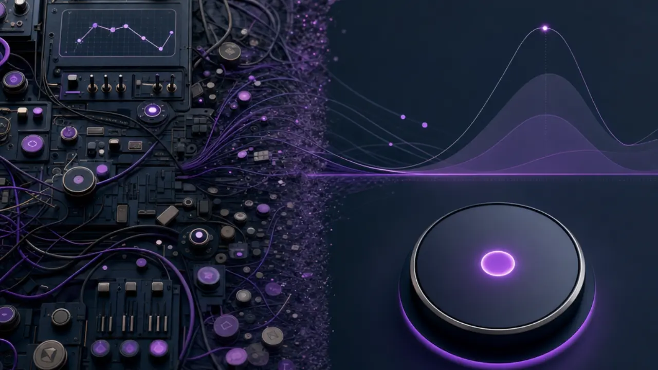
Every new category starts by serving the enthusiasts who will tolerate rough edges. Prediction markets were no exception. But the audience is broadening fast, and the habits early adopters accept — connecting a crypto wallet, reading an order book, translating prices into probabilities — are barriers for everyone else. The leaders’ interfaces reflect where the category came from, not where it is going. That is not a criticism of their success; it is the normal gap between a first-generation product and a mass-market one. If you are new to the concept itself, our guide to how prediction markets work is a good starting point.
The UX Problems Holding Prediction Markets Back
Where the Friction Lives
- Onboarding — too many steps before a user reaches their first market.
- Probability display — raw prices that are not intuitive to non-experts.
- Discovery — thousands of markets with weak tools to find the relevant one.
- Funding — wallet and deposit flows that lose people at the last step.
- Resolution clarity — uncertainty about how and when a market settles.
Onboarding and the first market
The distance between arriving on a platform and understanding a first market is where most newcomers drop off. Every extra concept — accounts, wallets, terminology — is another chance to lose someone. The strongest consumer products shorten that path to almost nothing, letting users grasp the core action within seconds.
Making probability intuitive
A market price is a probability, but it rarely looks like one to a first-time user. Interfaces that lean on order books and raw prices assume familiarity most people do not have. Presenting an outcome as a clear likelihood — and explaining what it means — turns an intimidating screen into a readable signal. For more on reading these numbers, see how accurate prediction markets are.
Discovery and clutter
A marketplace with thousands of live questions is impressive, but it can also be overwhelming. Without strong search, categorization, and curation, users struggle to find markets they actually care about. Good discovery makes a large catalog feel manageable instead of chaotic.
Funding friction
Many users get all the way to their first market and then stall at funding — asked to bridge crypto, manage a wallet, or navigate an unfamiliar deposit flow. Every additional step here costs conversions. Simple, familiar funding options remove one of the biggest points of abandonment.
Trust and resolution clarity
Users need to know exactly how a market will be decided before they participate. When resolution rules or sources are buried or ambiguous, confidence drops. Showing the resolution criteria plainly, up front, is a design choice as much as a policy one — and it is central to trust.
Why the “One Company Changes Everything” Moment Matters
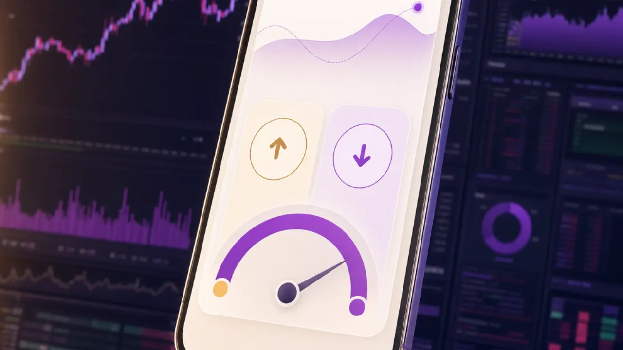
Categories often reach an inflection point when a single product resets expectations for what “easy” means, and competitors are forced to follow. Prediction markets appear to be approaching that moment. The leaders have proven demand; the opportunity now is to make participation feel natural for people who are not steeped in crypto or trading. Whoever does that well could reshape the field — which is one reason the current Polymarket–Kalshi duopoly may be more contestable than it looks.
What a Better Experience Looks Like
The Bar the Next Platform Must Clear
- Instant clarity — a new user understands a market within seconds of landing.
- Probability first — outcomes shown as plain likelihoods, not raw order-book prices.
- Frictionless funding — simple, familiar ways to get started.
- Guided discovery — easy paths to the markets a user cares about.
- Transparent resolution — clear rules and sources shown before participating.
Where Nexory Fits
This is the problem Nexory is built around. Instead of replicating a trading terminal, Nexory frames outcomes as simple Yes/No prediction markets with an emphasis on clarity — the kind of experience mainstream users expect from modern apps. It is a deliberate choice: in this category, the best product experience, not just the deepest liquidity, is what earns the next generation of users. For a side-by-side view, see Nexory vs Kalshi and our roundup of Polymarket alternatives in 2026.
Experience the Difference
Prediction Markets, Made Simple
Nexory turns real-world events into clear Yes/No prediction markets — designed to be easy to read, easy to follow, and easy to explore.
Explore Predictions on NexoryThe Bottom Line
Prediction markets have proven their demand; the next challenge is their experience. The platforms that reduce friction in onboarding, funding, probability display, discovery, and resolution will be best positioned to win the mainstream audience now arriving. In a category this young, experience is not a detail — it may be the deciding factor.
Frequently Asked Questions
Why is user experience such a big deal in prediction markets?
Because the audience is shifting from early adopters to mainstream users who are not familiar with wallets, order books, or probability math. Friction in onboarding and funding causes many newcomers to drop off, so the platform that makes participation feel simple has a real advantage.
What is the hardest part of a prediction market for new users?
Two things stand out: understanding what a price actually means as a probability, and getting funded. Interfaces built around raw order-book prices and crypto wallets assume knowledge that most new users do not have.
Can better UX really challenge Polymarket and Kalshi?
It can be a meaningful lever. The leaders have depth and brand recognition, but their products still leave room for a clearer, simpler experience. A platform that resets expectations for ease of use could win newer users, even if it does not match total scale right away.
What does a well-designed prediction market look like?
It makes a market understandable within seconds, shows outcomes as plain probabilities, offers simple funding, helps users discover relevant markets, and states resolution rules clearly before anyone participates.